I’ve been adding a lot of validations on the client side lately, using native HTML validation. It’s fast, reliable, and there’s no need to hit the server just to check for errors.
One of the most versatile options is the pattern validation. You can add a pattern attribute with a regular expression to an input, and when the form is submitted, the value is automatically checked against it.
If it doesn’t match, the browser shows an error message right on the input.
<input type="text" pattern="[0-9]{3}-[0-9]{3}-[0-9]{4}" />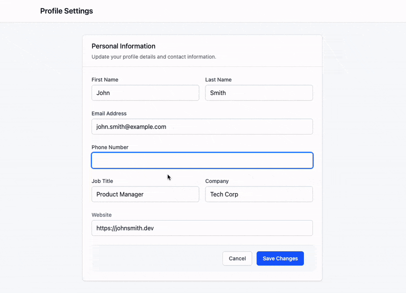
If you also add a title attribute to the input, the browser will show that text as part of the error message when the form is submitted.
<input type="text" pattern="[0-9]{3}-[0-9]{3}-[0-9]{4}"
  title="Please enter a valid phone number. Example: 555-123-4567"
/>
This works great, but I thought it would be even better to show the message below the input while the user is typing — that way, they can correct the value before submitting the form.
Let’s do that with a single CSS class and a super simple Stimulus controller.
Displaying the message
The idea is to add a CSS class to the input’s container and show the message below it when the input is invalid.
<div class="input-with-validation">
  <label ..>
  <input pattern="..." title="..." />
</div>
Then we can write a CSS rule that displays a message below the container. We’ll use the ::after pseudo-element together with the :has() selector:
.input-with-validation:has(input:invalid)::after {
  content: "Please enter a valid value";
  display: block;
  color: red;
  font-size: 0.8rem;
  margin-top: 0.25rem;
}
With this in place, the message will appear just below the input when it’s invalid.
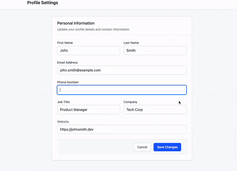
Displaying a custom message
With a simple CSS rule, we were able to display a message when the input is invalid. But wouldn’t it be even better if we could show the actual text from the title attribute? Let’s do that!
We can use a data attribute to set the content dynamically:
.input-with-validation:has(input:invalid)::after {
  content: attr(data-error-message);

  /* ... */
}
If we set that data-error-message attribute with the input’s title, we’re all set. And we can do that easily with a Stimulus controller.
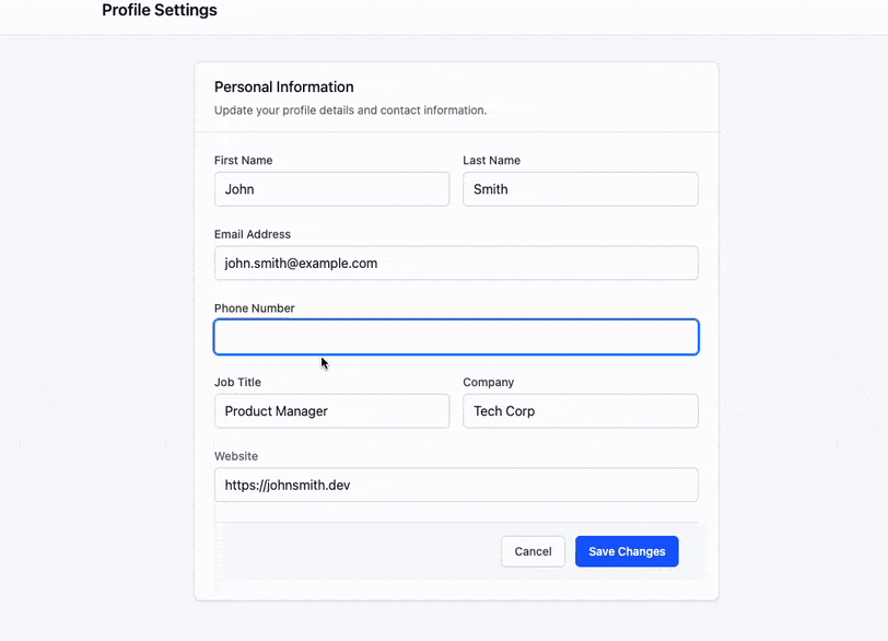
Instead of manually adding a CSS class to the container, we’ll connect it to a Stimulus controller and define the input as a target:
<div data-controller="input-with-validation">
  <label ..>
  <input
    pattern="..."
    title="..."
    data-input-with-validation-target="input"
   />
</div>
Then, in the controller, we can both add the class and set the data-error-message attribute when it connects:
export default class extends Controller {
  static targets = ["input"]

  connect() {
    this.element.classList.add("input-with-validation")
    this.element.dataset.errorMessage = this.inputTarget.title
  }
}
And voilà! With just a few small changes, we get a clean, reusable way to show custom messages right from the HTML.

One more thing ✨
Since we built a generic controller, we can reuse it for other types of inputs too — like email and url.
As long as the input has a title and a native HTML validation rule, the message will show up just the same.
<div data-controller="input-with-validation">
  <label ..>
  <input
    type="email"
    title="Please enter a valid email address"
    data-input-with-validation-target="input"
   />
</div>

<div data-controller="input-with-validation">
  <label ..>
  <input
    type="url"
    title="Please enter a valid URL"
    data-input-with-validation-target="input"
   />
</div>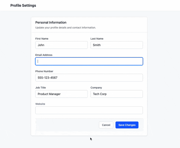
That’s it! 💪
With just a bit of CSS and a tiny Stimulus controller, we turned native HTML validations into something more useful and user-friendly. And the best part is, it’s completely reusable across different inputs.
If you try it out or improve on it, I’d love to hear how it goes!