How many times have you disabled a form’s submit button to ensure users fill everything out… only to leave them guessing what they need to do to enable it? It might sound a bit like a tongue-twister, but I’m here to help you untangle the issue.
First things first: what is a button?
Nielsen Norman Group defines a button as “core user-interface elements that, when clicked or tapped, execute an action. When designed correctly, buttons set accurate user expectations and help them understand how to interact with the interface.”
Button States
It’s a best practice for a button component to have different states to give feedback to the user and communicate what’s happening. The most common states are:
- Enabled: This is the default state and indicates the button can be clicked.
- Focus: Appears when navigating with a keyboard, characterized by an outline indicating it’s selected.
- Hover: Specific to desktop devices, this is the color change that occurs when the mouse pointer moves over the component, showing it’s clickable.
- Pressed: Applies to both desktop and mobile; it’s the color change when pressed, letting us know something is happening.
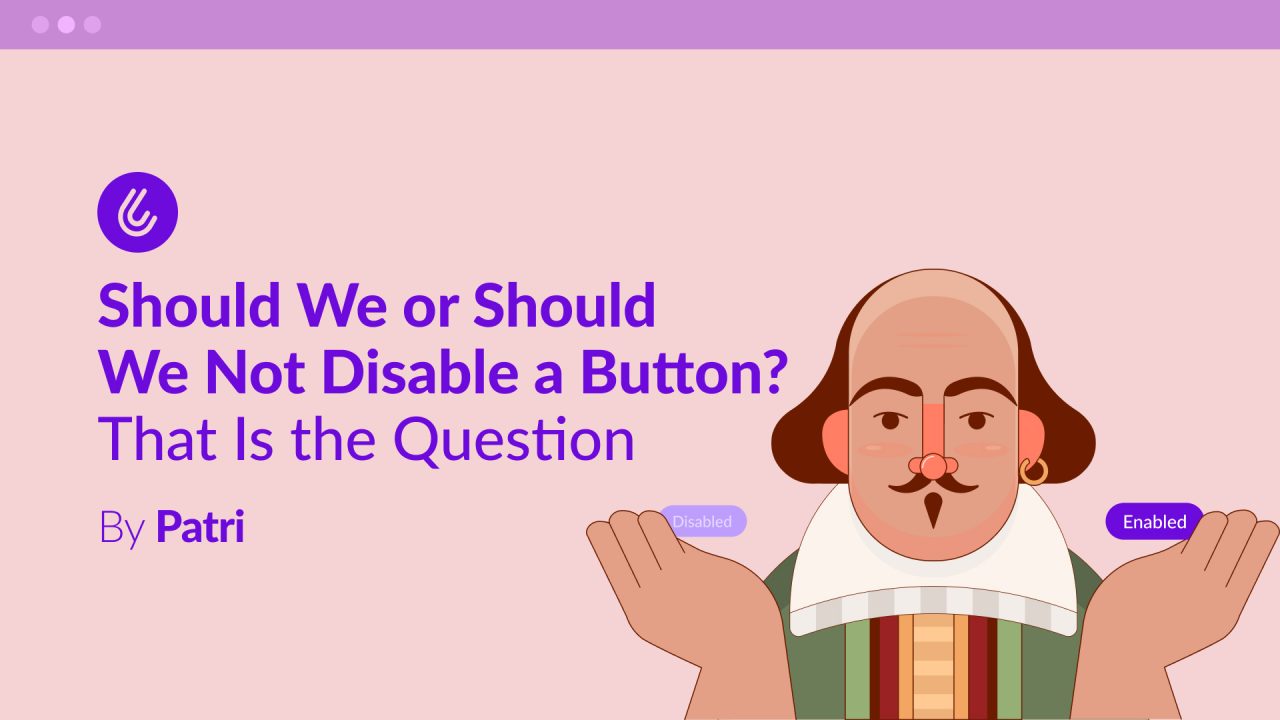
- Disabled: The one who brings us here today. A gray or a lighter shade of the original color is typically used to indicate that the action cannot be performed.

Why is Disabling a Button a Bad Idea?
As I mentioned earlier, it sometimes seems logical to disable a button in a form or the primary button on a screen until the user meets all the requirements to perform an action. We assume it’s obvious what the user has to do to enable it.
Let’s take the example of a form for creating a quiz game, where to enable the button, the user must:
- Enter a question
- Provide at least two answer options.
- Select one of the options as the correct answer.
Only after the user completes all of these steps does the “Start Game” button become enabled.

However, this solution can create multiple problems for our users:
- It’s confusing: Users might wonder what’s going on with the disabled button: “Did something break?”, “Hasn’t it finished loading?”, “What did I miss?”
- It causes communication problems: Are we telling the user what to do to enable the button, or are we expecting them to guess it? In our specific example, there are many actions to complete before the button is enabled.
- It has poor accessibility: By default, a disabled button in HTML cannot receive focus. This is a serious problem for users of assistive technologies because they will never know the button exists. They won’t understand the screen’s purpose or how to proceed.
- It interrupts the flow: Instead of enabling a smooth, seamless experience, we force the user to stop and think, question themselves, or look for workarounds, creating a poor user experience.
So, if we disable the button to prevent incorrect information from being entered or to ensure all requirements are met, but we don’t tell users how to enable it, how will they know what they’re missing or what they’re doing wrong?
A Better Approach
Going back to our example, let’s look at the complementary changes we could make while keeping the button enabled to create a more intuitive experience:
1. Add a brief explanation under the title detailing the required steps.

2. With the button enabled, if a user tries to submit and a field is missing,
the focus should move to the first input with an error, along with its corresponding error message, so the user understands what’s happening.

3. Mark the first option as correct by default. This ensures an option is always selected, and the user can optionally choose another. This proactively handles the error and avoids the need for extra explanations.

The Ideal Solution
If there’s one thing we know in UX, it’s that the perfect solution doesn’t exist; some solutions work better than others depending on the specific situation. However, we’ve seen that disabling a button by default is not a good practice at all.
So, what can we do? The key is that we already know what the user needs to do to perform the desired action. Therefore, we can list these requirements and make sure to communicate them clearly, always providing actionable steps for users to complete tasks or correct their mistakes in a logical and predictable way.
A Few Final Tips
- Include error states with clear and concise messages about what to do if a user clicks a button and needs to recover from a mistake or a missing field. The best practice here is to move the focus to the first element with an error and display its corresponding message.
- Don’t use a tooltip to explain what’s needed to enable the button. If the instructions are that important, don’t hide them in a tooltip that the user has to hunt for or stumble upon by accident. Tooltips are not accessible by default. If you use them visually, you have to correctly build the relationship between HTML, CSS, and JavaScript so they work with screen readers — a problem you can avoid entirely by designing a flow that is simple to understand and interact with for all users from the start.
- If you’re worried about a button being clicked multiple times and sending multiple requests, you can disable the button while it’s in a loading state, as long as you provide clear feedback to the user about what is happening.
- If you have no alternative and absolutely must disable the button, use the aria-disabled=”true” attribute to let users of assistive technologies know that the button is there. This allows the button to still receive keyboard focus, and screen readers will announce its existence and its current state.
Did you know how to manage button states in an accessible way? Let me know in the comments 💬 and give me some applause if you found the article useful👏.