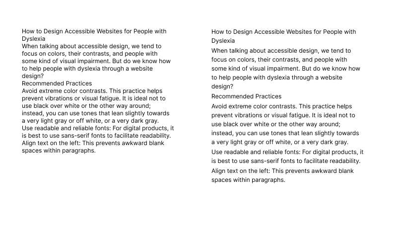
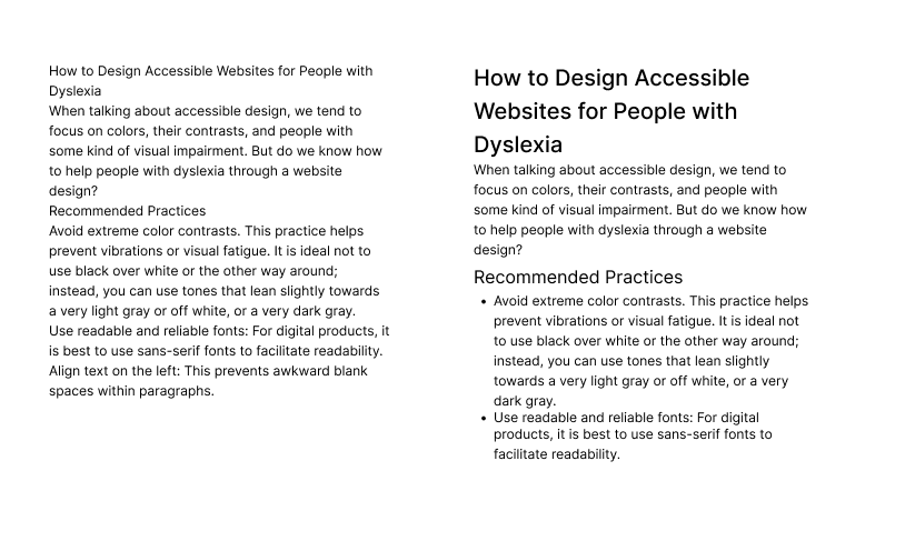
When talking about accessible design, we tend to focus on colors, their contrasts, and people with some kind of visual impairment. But do we know how to help people with dyslexia through a website design?
Recommended Practices
- Avoid extreme color contrasts. This practice helps prevent vibrations or visual fatigue. It is ideal not to use black over white or the other way around; instead, you can use tones that lean slightly towards a very light gray or off white, or a very dark gray.
- Use readable and reliable fonts: For digital products, it is best to use sans-serif fonts to facilitate readability.
- Align text on the left: This prevents awkward blank spaces within paragraphs.

- Increase spacing between text: Ideally, line height should be 1.5 times the font size, and the space between paragraphs should be 2 times the line height.
- Structure the content: Use titles, lists, and highlights for easier content interpretation.
- Allow style customization using relative units, such as em or rem.
Ensuring the proper structure and presentation of our content will help people with dyslexia to have a more fluent experience.